We are still planning on using the paint chips. After hours of cutting and pasting, that aspect is done. We had no idea how we were gonna make our design into a card. We thought of saving money and making Christmas post cards. But my position at Michaels opened a new possibility. Plain Cardstock. Now we are using the paint chips, rubber stamping techniques and ribbon to get the job done. I don't want to give away too many clues as to the design since I like my cards to be a surprise.
 One thing that has come to be expected and enjoyed in my Christmas Cards, is the photo included with each one. At first it was a sticker of my face sealing the envelope, and last year it evolved to a photo greeting (as shown above). Since money was tight this year, I hadn't planned on putting photo in. I spoke with my grandma and she specifically asked for them. Then I heard about Shutterfly's 50 Free Holiday Cards for bloggers. Not only did this give me a chance to fulfill our needs, it opened a whole world of possibilities.
Up until now, I hadn't thought of a theme outside of our cards. Last year, we had a cute and fun photoshoot in the snow up at SnowBowl which melding well with our store bought cards that had a winter wonderland type picture on the front. Topping that was gonna be hard since we already started the cards. But I think we have a great idea as far as our picture goes. It will show off our goofey personalities and some uniqueness! Thankfully, Shutterfly had a bunch of awesome photo card styles that I think will go great with our photo while still matching our Christmas Cards.

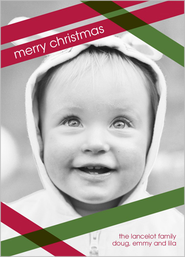
We managed to narrow it down to 4 potential cards for this year. I am listing these in the order they appear on the website and not importance. I like keeping my element of surprise. First on the list is All Wrapped Up/Pretty Package. I really like how plain they are. The small little stripes are a nice detail to it, and it provides plenty of space and room for attention to be paid to our picture. Since we have the cards with messages already, it is nice to have something that won't be too redundant. Of these two we are leaning more towards the one with the blue stripe.

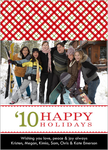
Our other choices have a little bit more flair and design to them. Next on our list is Berkeley's favorite. It stands out and really contrasts to the design of cards in a complimentary way. It is a little bold for my liking, and probably would have never considered it otherwise. But, this is a joint effort and Berkeley gets a say as well. It is called So Plaid and that is the true definition of it. I personally think it would be great for a family portrait, and not just the two of us. But like I said, Berkeley gets a say too.
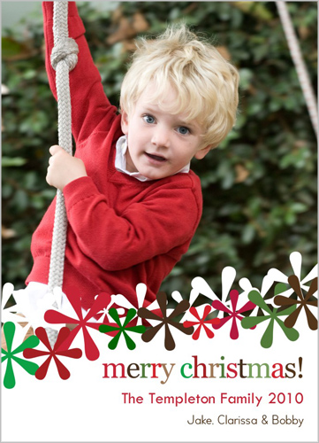
 Last, but certainly not least, is the Confetti Flowers card. I think this one is a perfect blend between plain and decorative. It is a little more than just words, but the extras are not overwhelming the photo. I can visualize our goofey picture on this template instead of that cute toe headed little model kid.
Just going through all the options to get the links and photos for each of these cards, I keep finding other things that I think might work as well. Most offers like this limit to only their less popular design templates, but not this one. So many choices. I am just really glad, we were able to find this promotion. It gave me a chance to share us with the important people we don't get to see very often right now.
As per our blog disclosure, I would never make this post if I didn't feel like this is a good offer. I also want to point out that even though we are advertising a product, we are not getting paid for a certain point of view. If I didn't think this was a good idea, and a good product, I wouldn't post about it.

2 comments:
I love the top card you posted and the pictures of you and BK are fabulous!!! Is that one of the cards offered in the promotion? I can't find it anywhere :(
No, the first one with the pictures of us already was from last year. We got it from seehere.com
They didn't have a promotion this year, or else I would have gone with them. We pretty much designed them all ourselves. The saying came from Berke's shirt.
Post a Comment